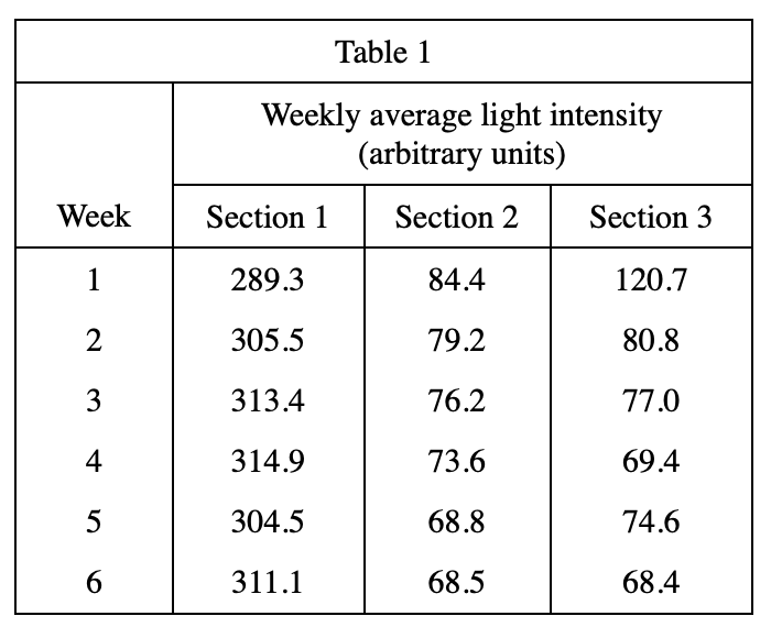
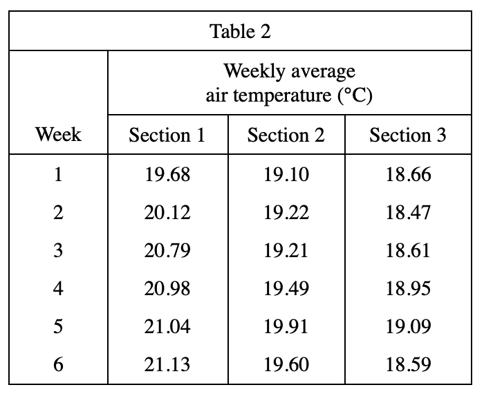
3. A plot of weekly average air temperature versus weekly average light intensity for Section 1 is best represented by which of the following graphs ?
Answer and Explanation
Your Answer is
Correct Answer is A
Explanation
Combining the two tables, it can be observed that the temperature of Section 1 generally increases with the increase of the intensity, so choose A