4. The results of Experiment 1 are best represented by which of the following graphs?
Answer and Explanation
Your Answer is
Correct Answer is J
Explanation
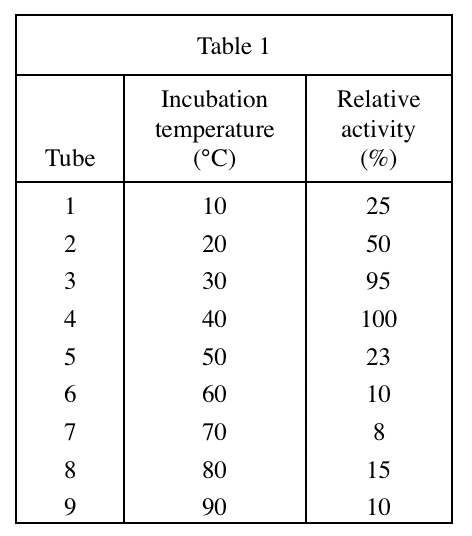
Look at table 1, when the temperature is lower than 40°C, the higher the temperature, the greater the relative activity, so the line segment should first show an upward trend;
At 40°C, the relative activity reaches the maximum value, if the temperature continues to rise, the relative activity will decrease, and the J option conforms to this trend